Wednesday, May 31, 2017

Page on monthly anomalies in WebGL

Moyhu has had for about four years a maintained page with a WebGL display of temperature anomalies over each month since 1900. The anomalies come from TempLS, and use a 1961-90 base period. It is a color-shaded plot, in which the color is correct at each measurement point, and interpolated for the rest of the triangular mesh. The data used is unadjusted GHCN V3 and ERSST V4. The plot is the best source of detailed information about the current month in its early days.

I have been upgrading these pages (trends described here) to use the new versions of the WebGL facility. That has involved also upgrading the facility, and I'll show the new anomaly plot below the jump. I'll leave the old page in place for a few days.

The main upgrade was to enable use of on demand loading of data via XMLHTTPRequest, since it would take far to long to download data for all months. That involved creating selection menus (green block on right). To incorporate this in the facility, I have introduced user functions in the user file, needed to link the menus to URLs for the data. I have taken that further to allow user functions for the color scale and formatting of responses to click queries (you can display data for nodes in the mesh). It's all optional - defaults work as before.

So the plot is below the jump. You can select a year at a time, and the months will show as radio button choices (fast response). I'll describe the new facilities after the plot below.

Friday, May 19, 2017

New local station trends - comments.

Yesterday I posted a new WebGL map of station trends. I'd like to follow up with comments on two topics, both of which follow from a fix to a problem which added noise, and some bias, to the old version. With the clearer picture, I'd like to point out how the trends really do show a quite smooth consistent picture, mostly, even before adjustment. Then I'd like to talk about the exceptions (USA and China) and the effect of homogenisation.

Then (below the jump) I'll talk more about the effect of removing seasonality,. It is substantial, and, I think, instructive.

First I'll show Europe - unadjusted on left, adjusted on right. All images here are of the thirty year period from 1987 to 2016. It shows a pattern typical of most of the world, with a large degree of uniform warm trend, with a few exceptions. The cool blob on the left, in the N Atlantic, is a shadow of a more prominent cooling in that area in more recent years. The effect of adjustment is not so radical, but it does reduce some of the excursions, some almost fully. It's possible the excursions were real, but given the general uniformity, it seems more likely that they were inhomogeneities.


Next is the USA, with some of Canada in contrast. The density of stations is obvious, as is the inconsistent but strong cooling trend. The issue is TOBS. A lot of stations changed with the conversion to MMTS, and the canges were generally in a direction that created artificial cooling. With adjustment, which includes TOBS correction, the picture is much clearer. Still some cooling in the mid-west, but otherwise warming, as in the rest of N America.


Finally, China. The stations are sparser, but again fairly irregular, although te denser regions are more consistent. And this time homogenisation does not make a cosistent warming or cooling change. It does moderate some of the extreme cooling, so that might have a warming effect overall.


Finally, I would urge readers to check the page in detail, to see the overall effect of adjustment (the swap button helps here). The main thing to see is that adjustment does not have a general effect of increasing trends. It's true that it is hard to distinguish shades of red, but at least warm trends are not being created out of nothing.

Below the jump I'll deal with the seasonal issue.

Thursday, May 18, 2017

WebGL map of local station trends - various periods.

I have updated the page where I show trends over various periods at GHCN land stations and ERSST measures at sea. The old page is here. The map shows trends as a shaded color over the triangular mesh. The shade is exact for the nodes, which you can also query by clicking. Posts on the previous page are here and later here.

The page is not automatically updated, since the trends are at least two decades. However, the previous page was made in 2012, so a data update was needed. And it makes sense to use the new MoyGLV2.1 WebGL facility. I had been slow to update the old data partly because I had used a rather neat, but hard to debug, mesh compression scheme, described here. Each period needs a separate mesh, so that helps. However, downloads are now generally quicker than in 2012, so the full 3 Mb of data does not seem so forbidding. So I have sadly let that go. However, for this post I have put the WebGL below the jump, as it still may take quite a few seconds for some.

I also updated the computing method to correct a source of noise in the previous page. I think the issue is instructive, and in 2012, I hadn't done the thinking explained in some of my many pages on averaging, eg here. I have frequently explained why anomalies are used in spatial averaging, to overcome inhomogeneities. But I had not thought they were needed for a trend at a single station. But they are - seasonal variation is a big source of inhomogeneity, and should be subtracted out. It shows itself in two ways:
  • If missing values cluster in a cold or hot time, especially biased toward one end of the period, then it introduces a spurious trend, and
  • you can even get a spurious trend with all data present. Sin(x) between 0 and 360° has a trend, rising almost the full amplitude. Taking 30 cycles reduces this by a factor of 30, but with seasonal range of say 20C, that can still be serious. Fortunately a calendar year is nore like cos, which doesn't have a trend over that period, but not all data runs a full calendar year at the end.


The remedy is to, for each station, calculate the mean observed seasonal cycle,, and subtract that out. I did that, to good effect. So, below the jump, or on the revised page, you can check ot trends from the last two decades to century plus. The radio buttons let you look at unadjusted or adjusted GHCN (prefixes un_ and ad_). One thing I found useful is to compare (swap button) two trends for the same period, one adjusted, one not. It is clear that homogenisation clears up all kinds of aberration, without greatly affecting the main trend pattern, which except for aberrations is quite smooth in space.

So below the jump is the revised map. There are some operating instructions on the page, or more detail on the WebGL page or post.

Tuesday, May 16, 2017

GISS April down 0.23°C - second warmest April on record.

I have been noting records showing a large drop from the very warm levels of March. NCEP/NCAR was down 0.23°C, TempLS down by0.165°C (now 0.16). GISS was also down 0.23°C, from 1.11C in March to 0.88 in April. But that is still warmer than any previous April except 2016. And it is warmer than the annual average for 2015 (0.82C), itself a notable record in its time. Sou has more. The April temperature is back to that of January, after the peaks of Feb and March.

The NCEP/NCAR dsaily record showed what happened. There was a sharp descent through the month, seeming to bottom out at the end. May has recovered somewhat, but is likely to also be much cooler than March, and is so far behind the April average..

I showed last month the year-to-date plot, compared with other warm years, noting that the year so far was ahead of the 2016 average, as shown by the red curve and horizontal line. Now YTD 2017 is right on the 2016 average. May will probably bring it below. Record prospects for 2017 now depend a lot on renewed El Nino activity. Here is the current YTD plot:


As usual, I will compare the GISS and previous TempLS plots below the jump. As with TempLS, there were fewer big features - lingering warmth in Siberia/Arctic, some cold in Antarctic.

Wednesday, May 10, 2017

Global surface anomaly down 0.165°C in April.

I've been waiting for three days for China to report - most others are very punctual lately. So it could change a little. But enough is enough - and last month, when I waited for China, they sent in February data, so it would have been better not to wait. Anyway, TempLS mesh showed a drop from 0.894°C in March to 0.729°C in April. That compares to a larger 0.226°C drop in the reanalysis index. Meanwhile, the troposphere indices went up - 0.08°C for UAH V6. As I often seem to have to say, it is a different place.

Despite the drop, April was still very warm. It was the 16th warmest month of any kind in the TempLS record. It was warmer than any annual average before 2016, including the then record year of 2015.

There was still quite a lot of warmth in the Siberia/Arctic region, and also in the east US. Antarctica was cold. Here is the breakdown plot:


Probably the main point of future interest is that SST is quite a lot higher. Elsewhere mostly moderate, which is a reduction for Siberia and Arctic.


Monday, May 8, 2017

The WebGL facility - versions.

Clive Best has been making good use of the WebGL facility. So I thought I should be more formal about versioning. I have been calling the current V2 a beta; I'll now drop the beta, and stop tinkering with V2, apart from bug fixes. The next version will be 2.1. I'll include that in the URL, and keep old versions posted, so for existing apps you won't be affected by changes, unless you call the update URL.

The main change I made (today) to V2 was to the dragging. There hadn't been any external control on update frequency, and so dragging a globe with a lot of triangles or lines could lead to superposition of successive images, with messy results. I have put in a 20 millisecs delay, so it can only update 50 times per sec. That delay doesn't seem to be perceptible, and mostly fixes that problem. You can vary this; the default is
U.delay=20.

The other main change is that there is now an option in the user file to define an additional function called MoyLate(p,U). This has the same syntax and functionality as MoyDat, but it is implemented after the extra objects like line (_L) edges. You can assign them properties at this stage; it wasn't possible in MoyDat(). You can't define new objects here, and it isn't the place to vary objects defined in MoyDat(). You can set colors, or maybe more usefully, vary the show property, eg
p.Mesh_L.show=0
That means that initially the line edges won't show, and the checkbox will be there but blank.

Another change is that in the calling HTML, you still need to provide a DIV tag before the script calls, but it doesn't need an ID. If you don't provide a DIV, it will go looking for somewhere to hang the app. In principle, this means that you can have several apps running on the same page (without iframes), but I think that needs more work.


Friday, May 5, 2017

Nature paper on the "hiatus".

There is a new Nature paper getting discussed in various places. It is called Reconciling controversies about the 'global warming hiatus'. There is a detailed discussion in the LA Times. The Guardian chimes in. I got involved through a WUWT post on a GWPF paper. They seem to find support in it, but other skeptics seem to think the reconciliation was effective, and are looking for the catch.

I thought it was a surprisingly political article for Nature, in that it traces how the hiatus gained prominence through pressure from contrarians and right wing politics, and scientists gradually came to take it seriously. I think they are right, but the process should be resisted. There really isn't much there, and the fact that contrarians create a hullabaloo doesn't mean that it is worth serious study. I'll show why I think that.

I'm going to show plots of various data since 2001, which is the period quoted (eg by GWPF) which excludes the 1998 El Nino. They weren't so scrupulous about that in the past, but now they want to exclude the recent warm years. Typically "hiatus" periods end about 2013. I recommend using the 
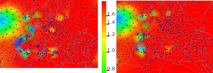
temperature trend viewer to see this in perspective. The most hiatus-prone of the surface datasets, by far is HADCRUT (Cowtan and Way explain why). Here is the Viewer picture of HADCRUT 4 trends in the period:


Each dot respresents a trend period, between the start year on the y-axis and the end on the x-axis. It's a lot easier to figure out in the viewer, which has an active time series graph which will show you when you click what is represented. If you cherry-pick well, you can find a 13-year period with zero slope, shown by the brown contour. And you'll see that the hiatus periods form two descending columns, headed by a blue blob. These are the periods which end in a fixed year (approx) on the x-axis - ie a dip. There are just two of them, and they are the La Nina years of 2008/9 and 2011/2. The location of those events determines the hiatus. If you look at other sets on the trend viewer, you'll see this much more weakly. At WUWT I listed the 2001-13 trends thus (error range converted to ±1σ):

DatasetTrend °C/cen
HADCRUT0.063 ± 0.301
GISS0.506 ± 0.367
NOAA0.509 ± 0.326
BEST L/O0.468 ± 0.432
C&Way0.489 ± 0.391


All except HADCRUT are quite positive. People sometimes speak of a slowdown. Incidentally, in the triangle plot, there is a reddish horizontal bar, bottom left, that is almost as prominent as the "pause". They are the strong positive trends that you can draw starting in 1999 - ie the 2001-6 warmth seen from the other end. I don't remember anyone getting excited about this feature.

I'd like to talk about the arithmetic of trends. Trend is a first central moment. It has a lot in common with moments of force, or torque. I think of it as a see-saw - a classic torque device. A heavyweight on the end has a lot of effect; in the middle not much. And of course, it depends which end. Trend is an odd see-saw, because it has both weights (cold periods) and uplifts (warm). It also has a progression. Items come on one end, and then progress across, exerting less and then opposite torque, until they drop off the other end (if you keep period fixed). So there isn't actually a lot of the period that is etermining the trend. It is predominantly the end forces.

I'll ilustrate that with this set of graphs (click the buttons below to see various datasets). It shows the mean (green) for 2001-2013 and colors the data (12-month running mean) as deviation from that value. The idea is that there has to be as much or more pulling the trend down rather than up, if it is to be negative. Either blue at the right or red at the left.


Now you can see that there aren't a lot of events that determine that. There is a red block from about 2001-6, which pulls the trend down. Then there are the two blue regions, the La Nina of 2008/9 and 2011/12, which also pull it down. The LN of 2008 has small torque on this period, but would have been effective earlier. @012 has the leverage, and so overcomes the sole uplift period or 2010.

That is just four periods, and it isn't hard to see how their effects can be chancy. It's really the 2001/6 warmth that is the anchor.

And then you see the big red period at the end, which overwhelms all this earlier stuff. GWPF and Co are keen to say that this is just a special case that should be excluded. Something like that it wasn't caused by CO2. But the 2001-6 period is also jus a natural excursion, and wasn't caused by CO2 either.

Basically the pause from 2001 won't come back until that big red is countered by a big blue. That would ensure that the trend returns close to that green line (extended). Of course, the red will be a powerful pauser for trends starting in 2015, and we'll hear about that soon enough.

Here is the same data colored by deviation from the trend from 2001 to present. We're still well on the red side of that too. The point here is that as long as new data lands above that line, it will be more red, and the trend will go up. It won't even reverse direction until you start seeing blue at that end. And if it did, there is a long way to go.


Now that the line has shifted, you can see how the blue periods would have destroyed such a trend earlier. But now, with their reduced leverage and the size of the red, that is where the trend ends up. For Hadcrut it's now 1.4°/Cen (other surface indices are higher).

So my conclusion is that, just as contrarians protest (with some justice) that not too much should be mad eof the current strong warming trends, because they are influenced by a single event, so too should the much waker hiatus be observed with modest interest, because it is the result of the concurrence of two weaker events, La Nina's, which get less noticed because they are less porminent, but are equally rather chance occurrences.


Thursday, May 4, 2017

Land masks, mesh and global temperature

I have been writing articles about land masks, leading up to using them to check and maybe improve my triangular mesh based TempLS. As I have tried to emphasise, the core of estimating global average temperature anomaly (or average anything) is numerical spatial integration. The temperature is known at a finite number of points. It has to be inferred for all the rest (interpolation) and the result complete data integrated. To do this successfully, the data has to be fairly homoigeneous, so anomalies are formed to take out variance in long term mean values. Then in the triangle method, linear interpolation is done within triangles.

But another kind of inhomogeneity is between land and sea, and indices often use a land mask to try to pin that down. In the mesh context, and in general, the idea is to ensure that values on land are only interpolated from land data; sea likewise.

The method corresponding to what is done with grids would be to count the mask elements within each triangle, and to divide coast-crossing triangle into a land and sea part. Since all that matters in the end is the weighting of each node, it's only necessary to get the area right. Assigning maybe a million grid elements to triangles is a rather heavy computation. So I tried something more flexible.

Here is a snapshot from the WebGL graphic below. It shows a problem section in East Africa. Light blue triangles are those that have two sea nodes, one land, and orange are those with two land, one sea. The Horn of Africa is counted as sea, and there is a good deal of encroachment of sea on land. That is about as bad as it gets, and of course there is some cancelling where land encroaches on sea.


So I refine the mesh. On the longest 20% of lines in such triangles, with land at one end and sea at the other, I make an extra node, and test whether it is sea/land with the mask. Then I give it the value of its matching end type. With the new nodes, I then re-mesh. This process I repeat several times. After respectively four and seven steps I get:

As you see, the situation improves greatly. new nodes cluster around the coast. There is however, still two rather large triangles at sea with a land node. These can show up when everything else seems converged; it is because of the convex hull re-meshing which may make different decisions about some of the large triangles bordering the coast. It slows convergence.

As to placement of that new node on the line, that is where the mask with a metric comes in. I know the approx distance of each node from the coast, and can place the new node where I estimate the cost to cross. I don't want it to be too exact, just to minimise the interior nodes created.


What I really want to know is what this does to the integral. So I tried first integrating the mask itself. That is a severe test; the result should show land/sea proportions as in a count of the mask. Then I tried integrating anomalies for February 2017. I'll show those below, but first, here is the WebGL showing of the seven stages of refinement (radio buttons).

Integration results

The table below shows the results of the progression. The left column is the area of the mixed triangles (part land, part sea), as a proportion of total surface. The next shows the result of integrating the mask itself, which should converge to 0.314. The third are the successive integrals of the anomalies for February 2017.

Mixed area
(fraction of sphere)
Integral of mask Integral of anomaly
°C, Feb 2017
Step 00.17660.31180.8728
Step 10.12680.32280.8583
Step 20.10970.31920.8645
Step 30.08450.32050.8655
Step 40.06820.32120.8646
Step 50.05780.32030.8663
Step 60.04890.32080.8624
Step 70.04290.31990.8611

Conclusion

I think it was a coincidence that the mask integration turned out near its target value of 0.314 at step 0 (no mesh change). As I said above, this is the most demanding case, maximising inhomogeneity. It doesn't improve because of the occasional flipping of triangles which leads to the occasional exceptions that show in the WebGL, but also because it started so close. For anomalies, the difference it makes to February 2017 is small at around 0.01°C.

So, while I am glad to have checked on the coast issue, I don't think it is worth incorporating this method in TempLS. It means extra convex hull calculation for each month, which is slow.


Wednesday, May 3, 2017

ERSST and Sea Ice

I use the NOAA ERSST V4 SST (Sea surface temperature) dataset as part of TempLS. It has the virtue of coming out promptly at the start of the month, and of course is the product of a lot of scientific work. But it has two nuisance aspects. One that I described last month, is that its 2x2° cells don't align very well with the coastal boundaries, and some repair action is needed. The other is the treatment of sea ice. ERSST returns values (if it can) for all non-land regions, and where there is sea ice, returns -1.8°C, which is the melting point of ice in sea, and so is indeed presumably the temperature of the water. But it isn't much use as a climate proxy there. Polar air over ice is often very much colder.

My aim is to mark these regions as no result, so that they will be interpolated, mostly from land. But that is complicated because, while -1.8 is clear enough, there are often temperatures close to that, which presumably mean mostly ice, or maybe ice for part of the month. So I have used a cut-off of -1°C.

I have been working recently with land masks to improve the accuracy of TempLS near coasts. My preferred version uses a triangular mesh with nodes at measurement points, so triangles will often be part land, part sea. It would be desirable to ensure that the implied interpolation uses land values for land locations. I'll post soon on how this can be done. But it sharpens the problem of sea ice, because the land mask doesn't recognise it. So I need to use some data, and ERSST is to hand, to mark this as land rather than sea.

So I have been reviewing the criterion for making that determination. I actually still think that -1°C is reasonable. To see that, I mapped the ERSST grid for Jan-Mar 2017 to show where the in-between regions are. I used WebGL.

It might seem that WebGL is overkill, since the polar regions can be easily projected onto 2D. But the WebGL facility makes it the easiest way. I just set all positive temperatures to zero, use the GRID type so I don't have to work out triangles, and then the color mapping automatically devotes the color range to the region of interest (and makes a color key).

So here is the plot (drag to see poles); in those months (radio buttons) it is Arctic that is of most interest. You can see that most of the region expected to be sea ice is in fact at -1.8C, and the fringe regions are intermediate. But there are also regions around the Canadian islands, for example, which show up as higher than -1.8, but would be expected to be frozen. A level of -1 seems to capture all that, without unduly modifying the front to clear ocean.

April NCEP/NCAR down 0.226°C

Temperatures rose from January to March but dropped right back in April, from March's 0.566°C to 0.34°C. That makes it the coldest month since the 2016 El Nino, behind December's 0.391°C. But even so, it was warmer than the annual averages of both 2014 and 2015, each a record in its time.

The main cool places were Canada, N Europe and Antarctica. China, E Siberia and the Arctic Ocean were warms was even most of the US.

Update - slightly OT, but you may notice that the TempLS report for March has a strange number (0.653°C) for that month. The main table above it has the correct number. The reason seems to be that in GHCN in the last few days, a whole lot of March data has gone missing, as you can see in the station map of the report. I hope they fix it soon. Fortunately, the lack of data prevents it updating the main table.

Update 2 - I wrote to GHCN but no response so far. Meanwhile, the pattern has changed - no longer whole countries missing, but more stations overall, so that now TempLS won't report at all.

Update 3. I got a response from GHCN saying that it was an ingest problem, now fixed. And it does seem OK now.